Case Study
Optimizing the Wheel
Product Page Future Vision
Introduction
Typically a Product Page has the most customer traffic then any other page on the site. So when I was asked to increase performance of this vital page it took more than wireframes and research. As the sole UX Product Designer on this team, it took communication, trust building and patience.
This is the overarching study for the entire optimization project, ongoing efforts, lessons, successes and failures. I will be breaking out the individual optimizations in their own Case Studies.
Project
Product Detail Page
Industry
Retail, Ecommerce, Video Commerce
My Role
Project Lead, UX/UI, Prototyping, Competitive Analysis & Research
Team
UX Researcher, AB Testing Specialist, Product Manager
Background
In 2021 I was assigned to the work with the Product Experience Value Stream to help to guide efforts with the user experience of the Product Detail Page (PDP) amongst other site elements.
At that time, there were several in-flight enhancement initiatives that were in various phases of design and testing. Very little was known as to why decisions for the direction of the initiatives were made and the majority were focused on minor cosmetic optimizations and “quick wins”. After helping with several long and laborious development attempts to complete these initiatives, AB Testing results were negative leaving the team guessing at next steps for future optimizations. It became clear that most initiatives were strictly business driven AB Testing concepts to increase a single KPI, and lacked consideration from Customer data collected by UX Research and Customer Insights. The team was also skipping User Testing to gain any Qualitative testing insights relying solely on a positive AB result.
Th major hurdle was the lack of understanding WHY tests were failing, and since these concepts did not ladder back to a bigger strategy for the Product Page, it led to guessing what else could be done. I have to understand WHY something isn’t working in order to improve it and with the amount of time it took to conduct a more complex AB Test, we needed to think Big Picture but Test Small toward an end goal.
It was at this time I began to develop a strategy for a PDP Future State. The goal was to give our team a strategy, grounded in purpose with the much need WHY answered. All verified with Qualitative and Quantitative test results to fill our team’s backlog for development to tackle when we had resources available. To started by gathering customer needs, business needs and any previous research and insights to help identify pain points and opportunities.
The Challenge
Creating a single Product Page experience for a Mass Merchant is challenging, but our team was also trying to drive consistency for our two biggest Brands who shared similar customers. On top of that our biggest Brand operates in several different countries which present their own set of challenges.
Business Needs
The main desire for the business was to re-imagine the current PDP experience to align with the company’s main differentiator as a Video Commerce driven shopping experience. This required focus on the main Video component.
Customer Needs
A simple and organized PDP experience which allows our customers to watch product focused video content without hindering the ability to explore the product features, colors, sizes, product specifications, customer reviews.
Competitive Analysis
Starting with the Baymard Institute, I began auditing our experience using their previous research and best practices as a guide. I identified which competitors in retail were nailing the suggested best practices and started compiling examples of elements of the PDP they were getting “right”. I realized that while each retailer had some differences, they tended to have more similarities in location, functionality and expected experience. Keeping in mind Jakob’s Law helped to determine initial layout and functionality best practices, but also pointed to experience elements that we would be able to take more liberties and explore to reflect our own unique brands.
Measures of Success
- Time on Page
- Increased conversion
- Decreased bounce and exit
- Reduced friction
- Reduction of customer call volume
- Increased adoption of writing customer reviews
- Increase customer satisfaction (NPS)
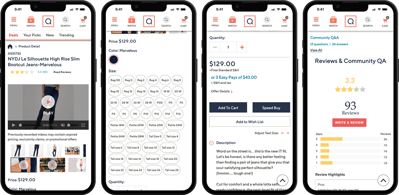
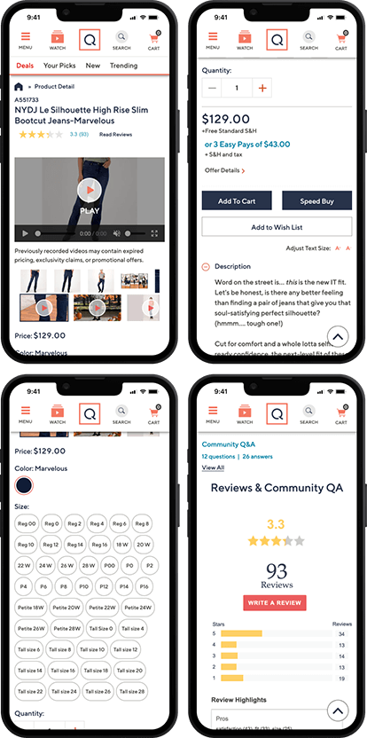
Current Design

Current Design

Identified Opportunities
Watch and Shop
The ability to watch the product video and shop product details without interrupting either processes.
Reduce Vertical Space
Reorganize the main elements of the Product Page and remove unnecessary items. This would help to reduce scrolling a customer has to do to sucessfully add a product to their Bag.
Organization and Visual Hierarchy
Years of minor enhancements have led to a customer experience that is unorganized and difficult to ascertain the basic information a customer needs to make a confident purchase.
Breadcrumbs
The Product Page template lacked the crucial navigational sign posts.
Swatches and Matrix Treatment
Swatch shape and size made viewing and tapping product thumbnails and colors difficult.
Price Block Complexity
Display of pricing structure is complex, crowded and lacks visual hierarchy creating confusion and uncertainty in purchase decision.
Consolidate Promotional Offers
Lack of organization and guidelines led to scattered placement of marketing offers and promotions in all shapes and sizes.
Read the Case Study
Product Reviews Inconsistency
Font, colors and spacing are different from our brand colors.
Key elements not visible to customers without scrolling
Add to Bag primary button is published below other noncritical information which pushed it way down the page hiding it from most customers.
Zoom Desktop and Mobile
Zoom functionality was limited and cumbersome to use. Mobile version was not optimized for the space available and limited the size of the image.
Matrix selection
Single item types still need a swatch selection which led to errors and additional interactions to allow customers to convert. Multiple matrix items are setup in a variety of ways by category which forces the user to relearn what they need to do, creating an overly complicated selection process. Breaking same items into multiple PDP because of size or quantity causes multiple page loads, multiple sku support and missed opportunities for conversion
Scroll Jacking
Customer while interacting with certain components like swatches and customer reviews were surprised and annoyed with the page automatically scrolling to a different vertical location. Especially when interacting with a swatch color or size, the page would scroll the product image back into view, scrolling the colors and sizes out of the frame, making it difficult to explore options without a higher level of scroll effort.
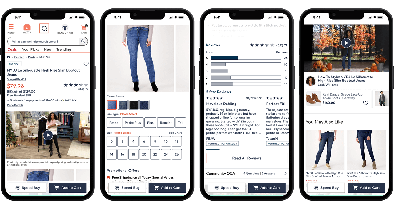
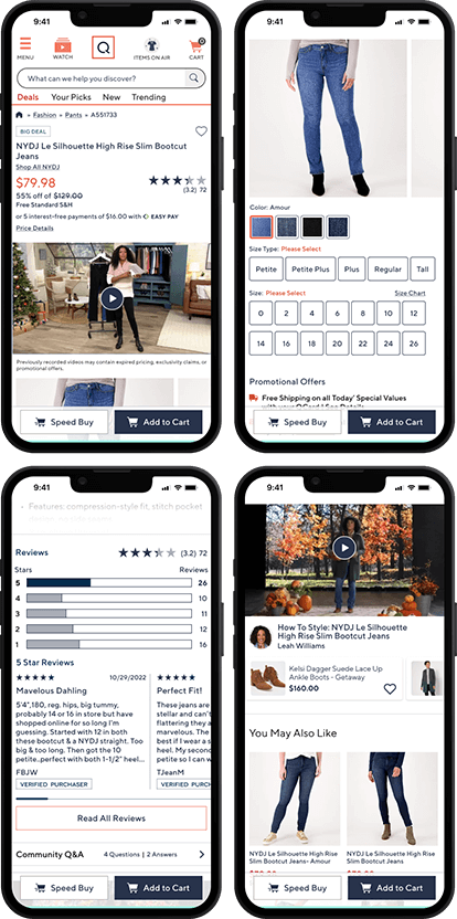
Future Design

Future Design

User Testing
Current Product Page VS Future State Product Page
Study Group 1
4 Avid Customers viewed Current State Desktop
Study Group 2
4 Avid Customers viewed Future State Design Desktop
Study Group 3
4 Avid Customers viewed both Current and Future designs on Mobile.
User Test Research Method:
First Click Test
All 3 Study Groups had comparable tasks, with customers asked to add an item to cart, view larger images, and further browsing more blenders. While also rating several aspects about the designs they viewed.
Metrics Collected
- Time on Task in Seconds
- Interactions (Clicks + scrolls)
- Task Success rating (from 1 to 5 self-report unless there was a failure that the participant did not acknowledge, then a 5 was selected by the moderator), and difficulty rating from 1 to 5, 1 being difficult and 5 being Easy.
Quantitative Summary
- Future State performed better in all conditions, predicting that these changes will not be a barrier to use and may improve conversion.
- 400% less interactions
- 200% reduction of time on tasks
- The average difference in interaction was over 250% improvement
- Differences between desktop and mobile experiences are smaller in future state, lending to a more consistent experience.
Positive Findings
- Customers consistently completed tasks on the future state faster and with fewer scrolls and clicks, this rivaled or beat the current state and suggests that the new features are low risk for further testing.
- Customers often immediately used the breadcrumbs and liked them. Current State PDP does not display breadcrumbs based on past AB Test that resulted in negative results.
- Changes were received well when we asked about them.
- Customers rated the future state slightly better for desktop, and about the same on mobile. This further indicates no major issues with the future state direction.
- Customers mentioned the convenient location of reviews in the desktop future state and liked it.
- Future State met Avid Customers expectations.
- Nothing was found to be missing despite the simplification of the amount of information in the Price Block area
Next Steps
Since the Future State Designs performed well and presented no risk to the customer experience, we will break out the identified opportunities and conduct AB Tests against current layouts.
