Processes
Buttons, Colors, Icons
Design System Overview
Introduction
Working on the same elements everyday across multiple platforms, breakpoints and teams can get a little messy. In order to keep elements consistent and organized we created a Design System in Figma. This is a high level overview of some of the elements as well as a bit of our process. Enjoy.
Project
UX Design System – Figma
My Role
UX/UI, Figma Setup, Prototyping
Team
UX Product Design Team
We began with an Audit
We split the site up by sections and began an audit of the common components following the Atomic Design approach. Starting here we felt we could make the most visual impact in our files and also our deliverables which would translate to the LIVE site.
Fonts and Colors Audit – Product Page
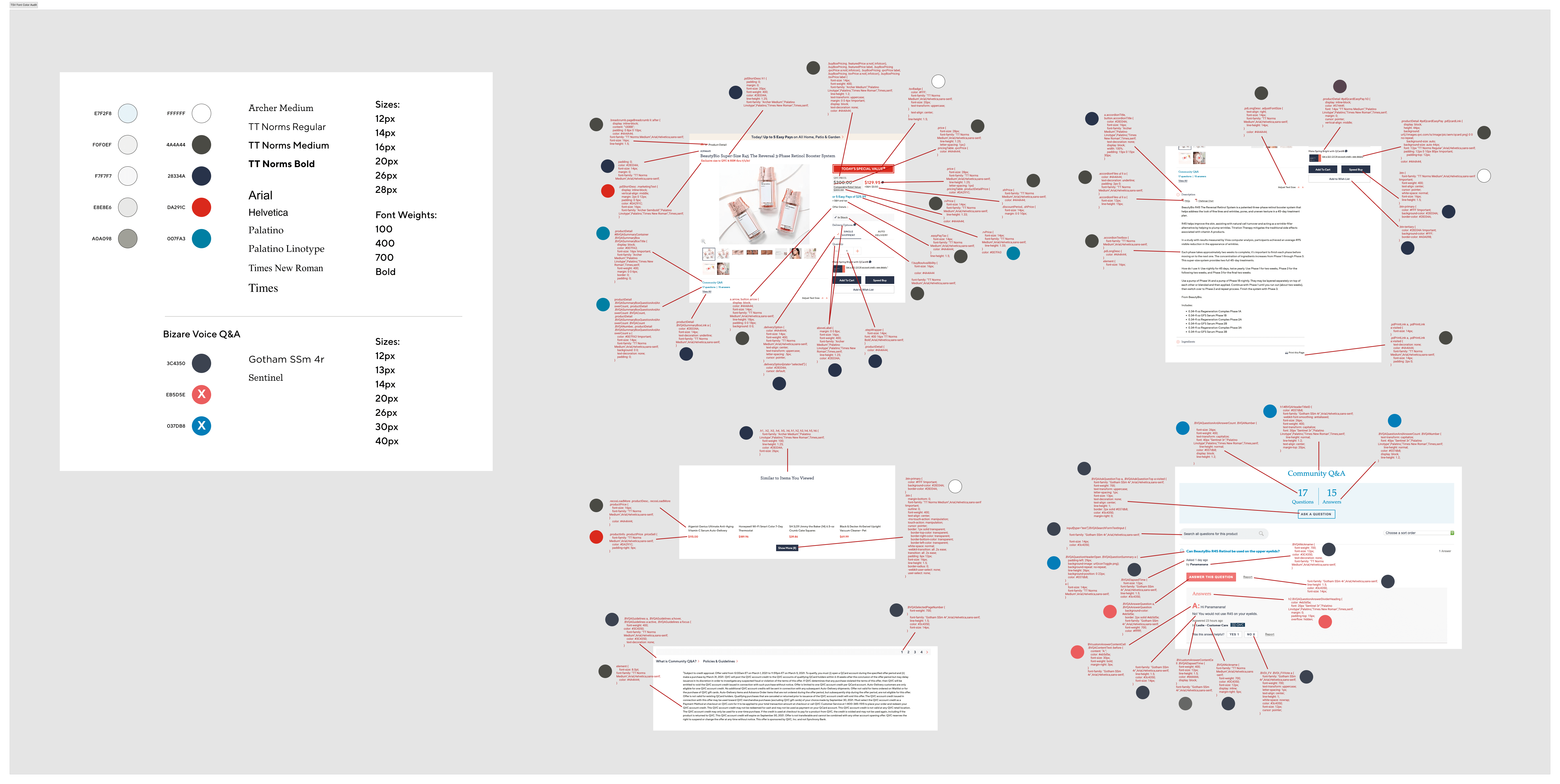
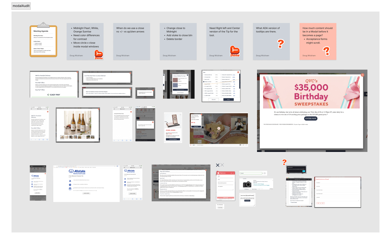
As a UX Team, we met often to discuss the various implementations of assets and elements we have published on our platforms. It was important to discuss how we could design a system with the least amount of elements without limiting the customer experience.
Audit of Modal Elements
Creating Consistent Atoms
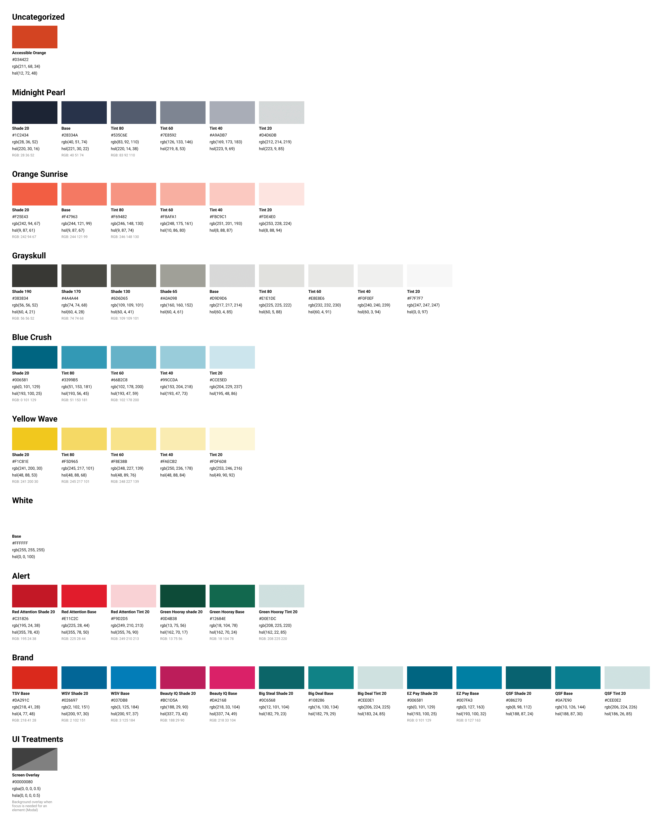
Once we establish what we needed and felt was useful, we started to bring the shared elements in line and create a consistent base of styles; Fonts, Colors, Spacing. This helped to inform the look and feel or basic elements that made up the majority of our published content and UI.
Colors and Shades – Figma
Icon Library – Figma Components
Audit of Modal Elements
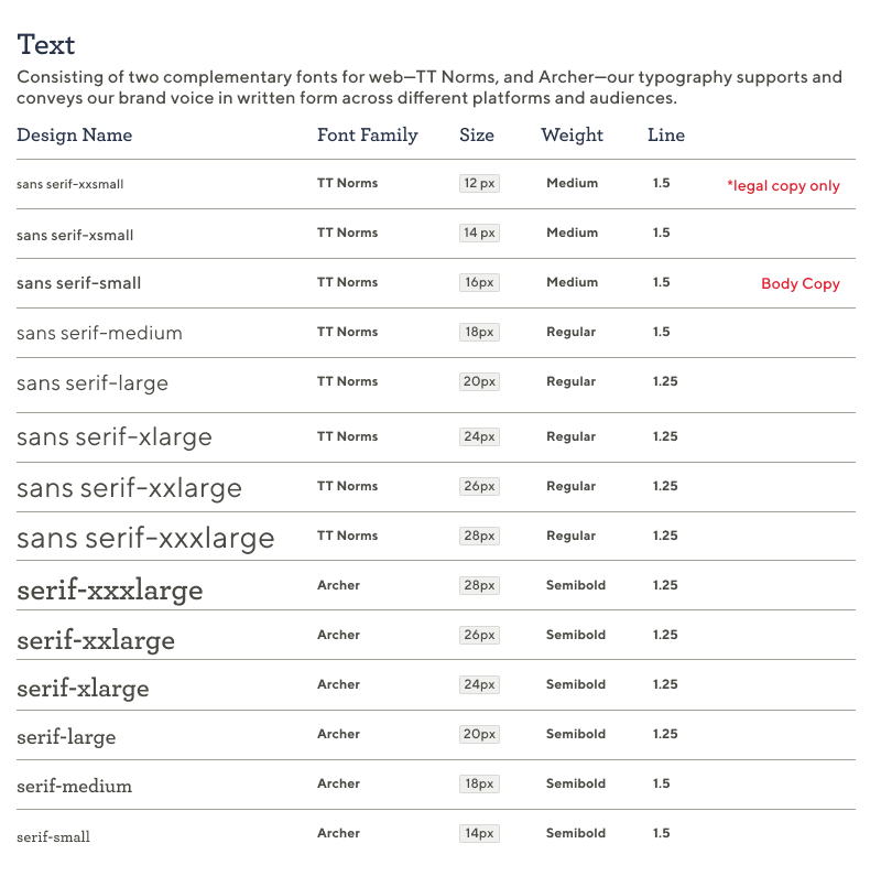
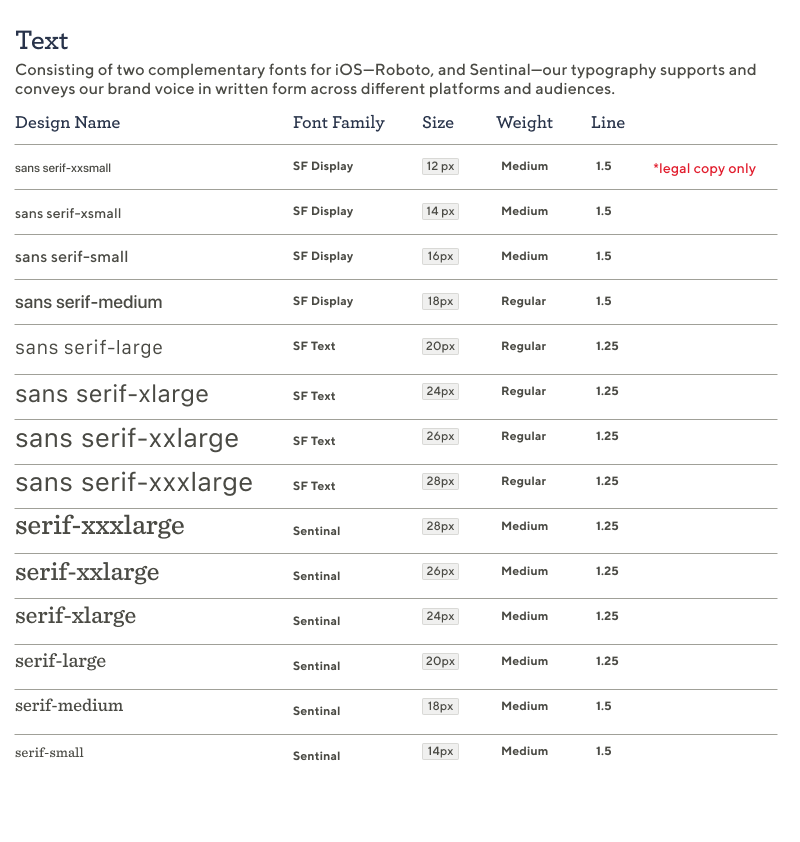
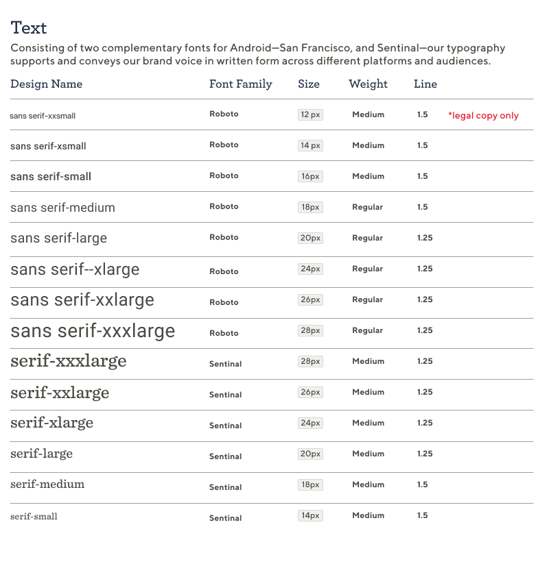
Combining Atoms
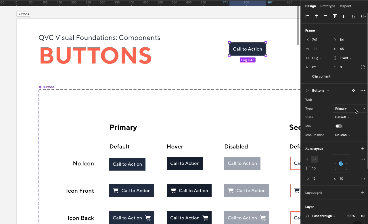
The next step was to create the smaller reusable components that make up the larger elements. To get the most of our designs and enable faster prototyping we built Figma Components into the shared Design Library Files. This allowed our UX Product Designers to change elements in their designs faster and consistently without having to micromanage styles and count pixel spacing. No one wants to do that.
Button Components in Action
Formalizing Elements on Page Level
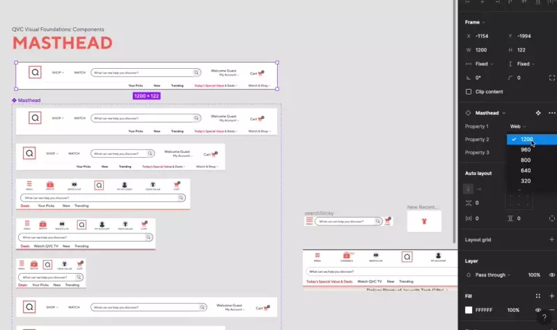
We then started building out components and elements that were specific to pages that were published on the site. This would enable speed to market and increase consistency. I know I have said that but its a theme…trust me it works. Below is an example of the Masthead that can be used across all breakpoints.
Masthead Component: Various States and Breakpoints
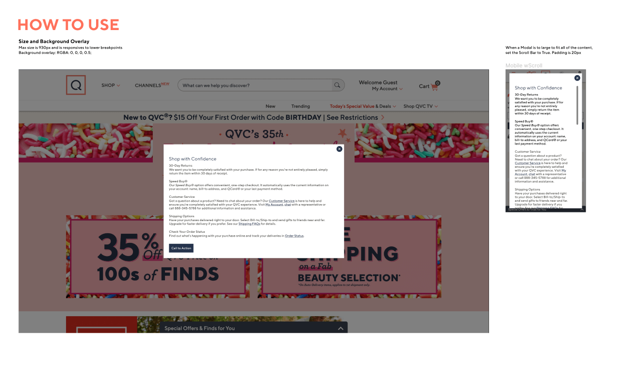
Modal Guidelines for Element Usage
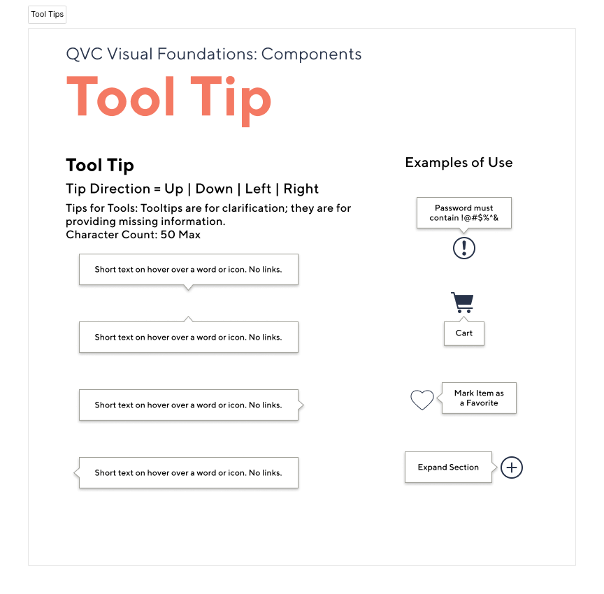
Tool Tip – Figma Sheet
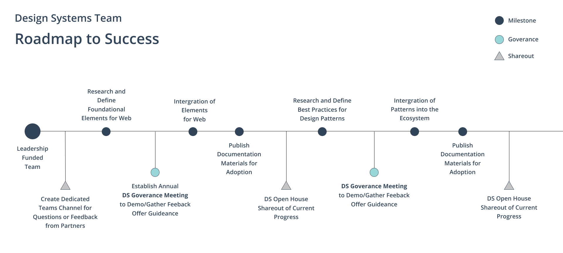
A Process for Enhancement and Governance
Going forward we needed a process to not only maintain but enhance our basic system beyond that of Figma and documentation. Pursuing buy in from Leadership and Partners is crucial to solidifying the Design System as a part of the company culture.
Proposed Design System Process
